Settings » Account » End-To-End encryption 
Congratulations to the new release. But I agree the UI update is a desaster. Moving the buttons make the one finger usage impossible. These upgrade kills the unique selling point from k9mail and make it interchangeable with other free tools like gmail.
I’m another user who just reinstalled v5.600 and happy with that. Please support the 5.6 version for longer. Thanks.
Just chiming in to say I HATE the new interface. And yes, I did find the list of accounts, but when I tap an account, I have to tap AGAIN to see the Inbox. And then when I hit the Back button, it exits the app altogether. WTF? WHO thought this was a good idea? I realize this is a free app, and as such, we get what we pay for. I would happily pay $$ to have the old interface back, but from the comments I’ve been reading, the developers have no intention of bringing it back. I have used and loved and recommended K-9 for years, but now it looks like it’s time to find something new.
I would also pay to have the old UI back.
Bring the back end improvements so that k-9 works properly with modern android but with the old UI.
The wording of @mscheaf might be blunt, but I’m afraid you’re wrong. This UI change waisted one of the main apps for my work. I would be happy to pay for a commercial, carefully supported product that resembles the k-9 mail of the recent past…
Basically the only decent / professional mail client for android is gone now. With 20+ accounts, both of totally different clients that I work for, mailboxes of my own company and private ones, handling a few hundred mails per day, I now literally will have to carry my laptop with me at all times and find spots every one or two hours to sit down and go through my mail (using emClient btw) in stead of quickly checking my phone. This is not a small inconvenience, it will change my work considerably.
And judging the storm of messages here I suspect I’m not the only one.
That said, it’s of course wonderful that people work on k-9 for the community, enhancing the functionality and fixing bugs! If only they’d learn from the phrase ‘if it ain’t broken don’t fix it’ …
Means: Shut up.
That last message showed me too, that to sign up here to give my comment (which was deleted) to help save my beloved app was not worth the time. But at least helped discover other app.
I thought I had added this to the now closed topic on the account overview, but must have missed the submit button. What I have to say fits here as well as anywhere else.
Besides K9, my other go-to android app is RealCalc. This hasn’t had an update since 2015, yet still seems to be collecting 5-star reviews & I see recent (July 2021) responses to reviews by the developer.
I would compare K9 to RealCalc & say that both apps provide something that is very useful to very many people & just works with a simple uncluttered interface. Both seem to have continued gathering downloads despite no updates & both have a high rating. A paid-for version of RealCalc grants a few additional features. While not really needing the additional features I bought the paid-for version as a recognition and contribution to the developer for their work in producing such a powerful, useful tool. K9 on the other hand has nearly lost me as a user & recommender with V5.8. I will continue as a user of 5.6, but certainly won’t be recommending it to any others, unless they want to side-load v5.6. If K9 was a paid-for app I’d be requesting a refund as V5.8 should be at least V6, or possibly a completely separate app (K9-Bling?)
The fact that yesterday (26/7) 20% of the total posts on the forum were from the preceding 24 hours (& a quick scan of the topics & posts showed a generally unhappy user base) suggests the developer(s) misread their users.
I agree to a lot of users: I use more accounts than only one and therefore the overview is missing. I.e. how many messages are starred in one folder.
Even in the folder itself: how many messages are unread?
If I mark one or more messages, I need to move them to Spam without opening them.
The nnew Design is nice but for me: “form follows function!”. So please add the missing things asap.
I have been reading all the replies here and cannot put myself in @cketti’s shoes, but I imagine it must be frustrating. To have put in so much work in what was planned as a major overhaul only to see a cacophony of outraged responses decrying it and claiming that everything has been ruined. That’s got to be disheartening.
While I certainly count myself among the chorus of voices who believes the new UI is a huge step in the wrong direction, I have tried to spend the better part of today assembling my thoughts and even going so far as to take screenshots in order to provide both concrete examples of how some of the changes have harmed accessibility and productivity in order to offer constructive criticism and not simply erupt with emotion and outrage.
(I’m not trying to throw shade at those who have come here to vent. It may not make it easy on the developers to see those posts, but these are all people who have had one of the most critical apps on their phone essentially taken away from them and those users have to turn somewhere with their grief and anger. Your pain is valid, but I’m trying a different approach here with my upcoming posts)
Next few replies will hopefully be able to attach images so I can explain some specifics. I would ask, in fact plead, that @cketti may take the time to review my comments.
Use the search function or click the very first topic in the list of topics: How to downgrade to an earlier version?
OK we’ll start kind of small. You can dismiss this if you wish but it’s a big deal to some of us.
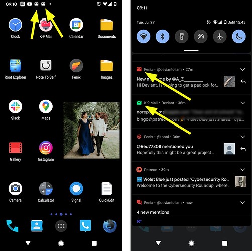
The old notification icon was great because it was unique. I could always tell when I had email.
The new notification icon uses a generic small rounded “envelope” that 100% matches the same icon used by other super common apps. These screenshots show me receiving email and also having received Twitter Direct Messages. Up in the black-and-white notification bar they are now indistinguishable.
[update: i have more screenshots to share so that we can continue this discussion, but i am at the forum limit for a new user to post. hopefully i can contribute to the discussion more soon]
Rather than be a typical user and hate all change at first sight, I decided to try it out.
I have several major issues with it. The main issue is the lack of the account overview screen. I absolutely need this screen. The unified inbox is exactly what I specifically want to avoid. I came here to see if there were options I wasn’t seeing, but I found this thread and the thread regarding the account summary page. Then I saw that thread was closed. That thread closure, and the apparent response of the developer regarding feedback, is worse than any of the UI changes.
I’m a developer myself, and I hate when users revolt against change simply because it’s different. So I understand what the developer is going through, but the attitude when faced with valid, helpful feedback is disappointing.
Regardless, I’ll post my feedback here.
For the account summary page:
I need this for my use case because my accounts are very different in terms of priority, email frequency, and email volume. The unified inbox does not work for me, and will never work for me. I have one account that gets a handful of emails a month, and I need the latest emails to stay in the top of the inbox (or the default display folder in K-9). I have another account that gets a few dozen a day, and again, I need the latest emails to be in the top of the inbox. I have another account that gets hundreds or thousands of emails a day. I need the notifications and unread counts for that one.
The unified inbox will never work for me precisely because it mixes messages from my various accounts and keeps the latest messages, across all accounts, at the top. I would never see the latest messages from my slower / lower-frequency accounts in the unified inbox because the faster / higher-frequency accounts would push those messages off of the list.
I also depend on the unread counts. I don’t use the star feature, but I know many others that do use this (in various email clients).
I’m also strongly in the habit of using the back button to get to the account overview screen.
I know I’ll get used to the other UI changes over time, but the lack of the account overview screen is a real deal breaker. If it doesn’t come back as an option in the near future, I may have to leave. I will stick around and hope that it gets added back. It’s still sort of there if you use the hamburger menu thing, but that’s not the same and it’s definitely not user-friendly to get to., especially if I plan on getting there hundreds of times a day.
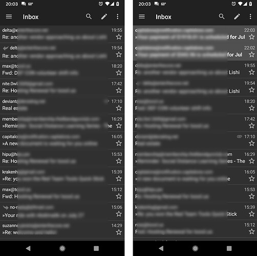
As was discussed in other threads about accessibility, the dark theme seems to have lost a great deal of its contrast between read and unread messages now. I understand that the text of unread messages are bold, but the two different tones of gray do not seem to have as much distinction from one another as they used to. Is this correct?
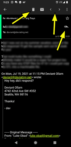
Of course, the greatest accessibility hindrance of all in the new version (from a simply “fingers on the phone” perspective) is the migration of all message control buttons up to the top of the phone screen. This eliminates a user’s ability to navigate, delete, and manage messages one-handed.
May we ask @cketti or other developers what the discussion and thoughts were concerning this change? Honestly, for me, if anything were to be moved up to the top of the message screen I might have liked to see something about attachments up there.
In super long emails (that are the result of chains of replies stretching back ages) when someone attaches something it’s a challenge to scroll endlessly down weeks of old replies in the window only to finally reach the bottom where the attachment is.
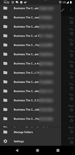
Another change that seems to be the result of the swing-out side panel style of UI is that there is less real estate on the screen now for folder names.
You can laugh at me, but my firm has a shared inbox that we use for managing old work and the like. There are many folders in there. It used to be feasible to navigate them in the old version. Now they are essentially unreadable and indistinguishable from one another.
@DeviantOllam good points and I agree it must be utterly frustrating for @cketti. I’m truly sorry for that, especially when so much work is put into the project. Cudos for spending time and effort!
That being said, I also hope @cketti will take the main issues that users all of the world now suddenly have into account and work on a solution before they’ve left…
@ByteHamster I see you’re a regular poster and a developer too… On that basis I’d be really interested to hear your comments on the motivations behind these changes. Care to share them? I think hearing a view from another perspective might help some see things differently, and whilst it might not necessarily change their minds it might help illustrate that all is not black and white.
it is a good overview wich account has how many new or starred msg and not mixed up by time. With a next tap (one single entry point) it was possible to open exactly this list, i.e. I want to work on all marked msg in one account.
I was not really involved in the design decisions. Just painted that striped image background of the navigation drawer but at that time, the drawer itself was already there. It’s around 3 years ago since I switched to the version with the new design, so I barely remember how it was before ^^
Ah okay, thanks anyway (I quite like that striped image by the way! ![]() ).
).
With you having used the ‘new’ UI for so long now I’m assuming you’ve got quite used to it now, even the action bar buttons being at the top?


