K-9 Mail is back (5.800 release)

What I really don’t get, on top of questionable design decisions and completely ruining the usability and work flow k-9 was known for:

There were 2 years with the new UI and only beta releases until the 5.8 update we have now.
What I absolutely do not get is why hasn’t the time been used to do something like a migration guide or documentation regarding the huge changes between stable releases?

The forum is full with questions like “how to do this, how to do that”! Even simple and basic things like selecting multiple mails, synchronization of all accounts, etc need to be asked in the forum. There’s nothing like a documentation regarding how to do X or Y in 5.8 now that you’ve done in 5.6.

Most apps nowadays have something like an introduction/tutorial on where to find what and how to do this or that.

Sorry, @cketti, but you got my taxes for implementing Jmap into something that “isn’t a product”, but an open source project you code to your liking. That’s what I call a hobby.

If it isn’t a “product”, tell me why you got funded by the “Bundesministeriums für Bildung und Forschung (BMBF)”? My taxes btw!!!
They do fund:

[quote]
Wir fördern Public Interest Tech: Technisch und anderweitig versierte Akteur*innen setzen ihr Können und ihre Kompetenzen im Sinne des Gemeinwohls ein und nehmen aktiv, systemisch, interdisziplinär und vor allem “bottom up” an Innovationsprozessen teil, um die hieraus entstehenden Tools und Technologien in den Dienst der Gesellschaft zu stellen.
[/quote] see: About - Prototype Fund

Something solely to your own liking isn’t “Gemeinwohl” (public interest).

Btw, I searched the forum, but haven’t found anything regarding jmap!?

So, k-9 is not a product, but simply an open source project of some developers, mainly you, @cketti. You get fundings of around 4k € a month for that “hobby” without owning anyone anything?

No documentation, no migration tutorial after a complete rewrite of the UI? Not even an in-app guide after doing a major release after 2 years?

3 Likes

It is, what it is. The questions is, where K9 would be today without the current developer(s). Probably long time dead?

Are there enough other developers ready to fill in or do a fork to our likings? I don’t think so. So at the end it’s on the current developers to decide, where the ship is sailing.

Yes, there are plenty of people unhappy with the destination, but at least the ship is (still) sailing. As for us passengers? We can jump ship anytime. Nothing in this world is forever, and we had good years with K9.

I’m going with v5.600 as long as possible. I’m not angry, I don’t own this ship. Of course would I’ve been really happy to see K9 further evolve in it’s former nature. But it is what it is.

I’ve seen enough over the last days to conclude for myself: @cketti is sitting this out until we all go quiet. People move on.

After years (!) of waiting for the next update, v5.800 doesn’t made a difference at all. Death by update or death by closing. Nothing is forever.

I’m only sorry for the ordinary people having to deal with the consequences now and essentially losing the app they’ve grown to for so many years.

I’m out of here now.

Waow That’s interesting 4000€ / months from German tax funds for a project the main dev says he doesn’t care about its success and never thought would be popular,
Now we learn he didn’t create it, it was already popular when he took over, says it’s only for himself while taking public funds to further developing it for the public.
And the guy is privately giving me lessons on how to behave on a public forum, how ironic !

2 Likes

Ah, interesting. I should pay your life :smiley:

it’s not a one-way street - at least i thought that.

First of all: Thank you very much for investing time and efforts into K-9; much appreciated. I am sorry, but I have to admit I like the “old” GUI better. I am colorblind and even if I can see (and distinguish) colors, they have absolutely no meaning for me; the old GUI was easier to use for me. If my vote counts, I vote for the old GUI :slight_smile:

2 Likes

Unless you want to keep using the old version, literally going back to the old user interface is practically not possible. A lot of the libraries and APIs used in K-9 Mail 5.600 are outdated by now. We’ll certainly not throw everything away and start from where the app was 3 years ago.

However, if you can let us know what exactly it is that makes using the app difficult for you, we can work on that. Messages in the Unified Inbox and regular folders have been color-coded in 5.600. But the new version is using less of those color chips than before. So I’m not clear on where the problem is.

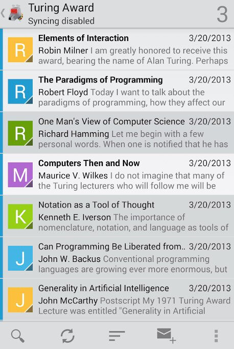
K-9 Mail 5.801 will display the account name (“Demo” in the screenshot) in the top bar where in earlier versions only the colored bars on messages would indicate which account was currently selected.

Please create a new topic and describe the areas of the current app that are hard to use for you as a color-blind person (and maybe what you think it was in the old version that made it easier to use).

2 Likes

Hi cketti, thanks for your immediate reply. I will create a new topic and try to explain.

1 Like

Export settings of all accounts before removing 5.8, get 5.6 (at f-droid …or any else), Restore settings.
You just have to type all passwords; they are not included in export file - of course;-)

1 Like

I don’t want to take sides as I find both views of the app beautiful and successful. Sure, everyone has their opinion and it is also allowed to express it, but it should also be praised what work “cketti” has done. Sure, not everyone likes the wallpaper in my living room, but the work was worth it. Perhaps it would be a way to integrate alternative, option a future selection of the view.

I admit, I have no idea about developing apps. So I can’t estimate how much work it does and whether it’s even possible. Sure, the value and the desire must be there. But it would be worth considering in my opinion. I still find K9 Mail successful. It’s nice if someone takes care of the preservation.

1 Like

Well, I don’t normally abandon apps after a poor update; but, the sheer downgrade to the UI, led me to switch over to FairEmail after 6-7 years.

Was good while it lasted, best luck for the future.

I have to admit, this is the first time in this forum here, and I don’t usually comment on any software development at all, but this time I really had to as this update to K9 is something that really hurts me.

Having been a user for many many years the only reason why I started using K9 mail in the beginning was that I just could not find any other app, even paid ones, that could practically handle multiple accounts independently from each other in an easy way. This was the killer feature in K9 for me, that really worked without any problem as practical as one could have designed it. In addition I do never sync emails automatically on my mobile, and also here K9 mail allowed me to do so in a second with just one button.

The new update (and I really really appreciate people putting their leisure time in open software development) basically completely destroyed all the killer features for me that made me use K9 in the first place - and also makes using the app with multiple accounts more complicated in complexity and time demand (old: one tap almost blindly possible. new: pull, drag, pull, refresh with full concentration on where to put the fingers). In the Status Quo K9 behaves just like any other bad email client and is ‘just another MS Outlook’.

Please K9-team, please, please undo those UI changes regarding multiple accounts and one-click syncing, as they really are destroying my long term fruitful relation with K9. Thanks for listening!

5 Likes

You get that we’re angry, yet there’s not one iota of a braincell that realizes you should not have ‘redesigned’ its UI the way you did?

" if you can let us know what exactly it is that makes using the app difficult for you, we can work on that."
Good grief, you really don’t get it.
Pathetic. Go do something else, please.

So, yet another post about the new UI (yeah, I know - boring!).

So it popped up in f-droid and I decided to try it out once again. My setup: 2 mail accounts (1 work, which I only keep when I really, really need to check something but usually it just stays dormant there) and one private account (with multiple e-mails aliases).

Most of the time my workflow would be (if not opening form notification, with pull every 4h or so) to open k9mile, open my account, pull to refresh (I know I’m expecting the email). Simple, easy.

I thought that the same could be achieved with the newer version: I wouldn’t bother switching to work account and just stick to my main account - should work. But for some weird reason I always ended up in unified inbox and almost always refreshing the mail triggered pulling work email, which I really, really don’t want.

The other major issue was moving action buttons to the top - from something very convenient that I could operate single handedly it became a chore (I despise people creating ever larger phones – currently “compact” phone is considered something it 6" screen… ffs…).

So after a day of use I reverted to backup and will just keep on using it.


One thing that struck me was @cketti recent message, that k9mail is his project (of course) and he develops it as he pleases (completely understood) - that’s the beauty of the OpenSource. But this kinda contrast with the recent blogpost: K-9 Mail is looking for funding and kinda leaves weird aftertaste…

1 Like

I propose a setting that may recreate most of the old UI within the new UI.

Call this setting “Side menu as home screen” or something.

Create a setting that makes the opened side menu opened a “home screen”.
Eg
-The app starts with side menu opened and account selection visible
-When picking an account from the side menu, the side menu does not auto close until a folder is selected allowing the user to select a folder such as Inbox etc.

This doesn’t try to throw the new UI in the bin and instead just allows it to recreate a behaviour similar to the old apps account overview.

For why I would prefer a non unified Inbox, it helps me prioritise mail from various places at a glance.
In an instant the old UI allowed me to see what account has new mail and I could instantly decide if I care to read it. The new UI to me appears to de-emphasizes which account and folder received mail.

There is a separate issues regarding buttons at bottom which can be addressed later and likely requires more effort.

3 Likes

I agree. Sometimes, a major overhaul is necessary. At first glance (use), it’s quite well done, even if done adjustments are necessary.
Loss of functionality must be very seriously thought through.
I personally find a one-finger-GUI important, which is currently impossible. The “load images” button was always in the swing place.

1 Like

It’s pathetic. The original developer would never have ok-ed these ridiculous changes. K9 has become just another shitty mail app now. It served a niche, it filled the gaping hole in email apps market. I will try and fork the code of the good UI version and release an actual update. Will ignore complaints of this deluded developer and change the name. In its readme I will mention why he’s been a fool.

2 Likes

Such nonsense. K9mail could have been forever. You could easily keep the old UI and update the backend. Have you ever for example seen Forté Agent? It has not changed because its users want it to be usable.

2 Likes

Apparently he is. What an idiot. Has he even looked at the Playstore score recently? not one user is satisfied with the changes.

@cketti I have to say after trial and error. K9 5.8 is exactly what I wanted. Now there are a few things I like to see returned but those are minor quips and of course future updates can address those things with those items returning or even a better way to implement them. For the years of hard work put into this I have to say thank you. The UI is more polished and I did find things easy to locate once I got used to the UI changes. This feels more polished and less clunky. I have no doubt it was hard to balance the need for function that K9 was always known for with polishing the UI and workflow to look more pleasing to the eye. Balancing form and function is a lot harder then it sounds. I find this to be a great start in a new direction and look forward to what you and your team will accomplish in the future. Again thank you and your team for this. :sunglasses:

4 Likes

First off, I appreciate the devs efforts and am glad there is active development on this app after a period where it appeared it might be dead.

With that said, I’m surprised that in 2021, a hamburger menu that opens a nav drawer ever made it past the “suggestion” phase. Very poor design and usability, there’s a reason why Google and other apps have abandoned this feature.

My suggestion - ditch the hamburger menu and nav drawer. Implement a bottom nav with one of the buttons spawning a bottom sheet dialog displaying the list of accounts many users want back.

As a developer, I appreciate the amount of time and effort something like this would require. But there are no deal-breakers here. There are several examples of apps that have made similar changes. As far as amount of work, of course all apps are different, with their own set of variables, potential blockers, etc. With that said, I’ve been on Scrum teams where a single dev has accomplished this type of feature change in one or two sprints. Yes, there’s solid work involved, but not exactly an “epic” change. Just trying to provide some perspective.

But even if it took longer and supplanted some other planned changes, doing this would improve the app’s usability 100% not to mention restore some goodwill between devs and users. And I don’t care how much devs might claim poor feedback and one star ratings mean nothing to them. Don’t believe it. Programming is challenging work, and it’s always gratifying to hear one’s work has been worthwhile and has helped make others’ experience better. Nobody wants to hear that their hard work and effort “sucks.”

4 Likes