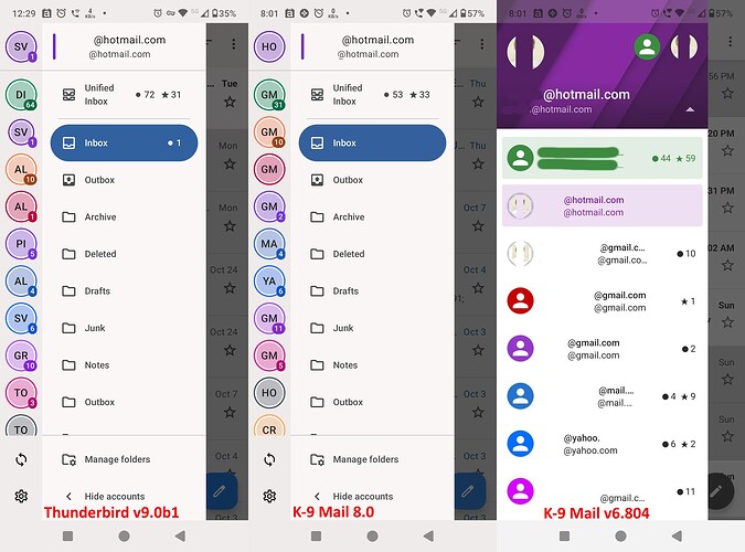
12 contributors to 9.0b1.
Great & in principal I would like to thank those 12 contributors. They are doing it with certainly all good intentions. That should never be forgotten.
Things can go wrong when decisions are made. That can be brought to their attention. This is what the forum is good for. But I do not at all understand the angry and even insulting messages.
Therefore, even if I am not happy at all with the latest user interface change and it might make me stop using the software completely I do not support bashing contributors to a great software product that is provided free of charge (with voluntary contributions only).
The prompt coming up again so quickly is certainly a bug that I’m very interested in solving. You shouldn’t be nagged into contributing financially, it should be a gentle reminder once in a while. The code currently should NOT show the prompt more than once at all, it would set a marker in the local data and once this is set not ask again.
Would you be willing to file a bug at GitHub · Where software is built and share more circumstances? Has it shown up more than twice? Did the app crash or restart around the time you received the prompts?
It sounds like you’ve seen other users experience this as well, could you let me know where that is?
For those of you wondering when the letter changes will go to release, we’re aiming for early December. This way you can at least customize the letters, this was a totally understandable complaint for the previous implementation, where even if you wanted to all you had is some color differences.
We’re certainly planning further improvements next year, such as being able to select custom images. This way you can for example show a Gmail Logo, a picture of yourself, or - a picture of three letters if two is not enough ![]()
I acknowledge the new design might not be for everyone, and change is hard. There are a bunch of things we could improve with a little more time, and this certainly won’t be the last improvement we make.
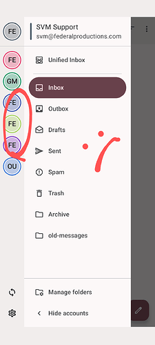
I don’t understand why it was changed at all though? In K-9 the different email accounts were showing the account pictures which was great - why wasn’t it kept that way but changed to those ugly and not very helpful 2 letters?
I’ve been a supporter of K-9 for years, even back when the layout was changed and the Unified Inbox introduced which made pretty much everybody mad, and I’ve always defended and spoken out for K-9. But this change for the worse is something I can’t defend at all, and I definitely don’t understand it.
Why take something that’s great, functional and good looking and make it bad? ![]()
Mira, I’m really trying to be helpful here, there is no reason for me to be misleading. If the prompt showing twice were a known issue we can reproduce, we would certainly fix it immediately. We’ve not encountered this so far, and had taken some engineering precautions so this wouldn’t happen. If you don’t want to provide information that is totally fine, but the best way to resolve these issues is together. Thunderbird and K-9 is built on the same code base, so most changes we make to K-9 Mail will also affect Thunderbird. This is why I am here answering questions.
Nimueh, updating the drawer was part of modernizing the code, and becoming more compliant with Material 3. As you can imagine we’re not intentionally trying to make it look bad, and we’ve also gotten much positive feedback (!) that it looks more modern and fresh. I very much appreciate your support, and its ok to not defend every change while still being a fan ![]() I hope we can find a balance over time that meets your expectations.
I hope we can find a balance over time that meets your expectations.
What I miss is that K9 uses the colouring I have in thunderbird. (Pressing 1,2,3,4,5)
I use that slot to highlight important emails thematically, while I use the star for general highlight.
Is it possible to add this?
It seem to work in-between different machines with thunderbird installed.
becoming more compliant with Material 3
Why? That’s a Google thing, and by no means should be mandatory. An app should be able to present its own UI, style, and elements.
Dear kewisch
As a long-time user with 11 email accounts, I found the old K-9 Mail (v6.804) interface both practical and user-friendly. It allowed me to easily distinguish and manage my accounts at a glance.
However, with the K-9 Mail v8.0 update, this usability was compromised. Instead of seeing photos and full email addresses, I was presented with confusing pairs of letters, such as:
HO GM GM GM GM MA YA GM GM HO CR
Now, with the latest beta version 9.0b1 of Thunderbird, these pairs of letters have changed again, but unfortunately not for the better:
SV DI SV AL AL PI AL SV GR TO TO
If this is what’s considered an “improvement,” I’m left wondering what the goal was. For me, this new design has only added confusion and frustration.
I hope future updates will prioritize clarity and ease of use, especially for users managing multiple accounts.
Regards
The idea of the 9.0b1 change is that it now shows the first two characters of the account name, instead of the first two chars of the email address domain (after the @), as previously.
Since you can edit the account name, you can prefix it with any two chars you choose, to try and help distinguish between accounts. It’s far from perfect, but does seem an improvement.
Note you can also choose the colours, if you find that helps.
Exactly!
I soooo hate the change to Material-anything, it makes everything look bland and ugly and I can’t for the life of me understand why pretty much all app devs jumped on that ridiculous Google bandwagon for it! ![]()
But it does provide clarity. Google calls the shots and by admission aesthetics takes precedence over functionality with these developers. Hence the abysmal accounts screen plus the fact it is here to stay. Mindless, but thats the the way it is.
Adding mt voice to this, once again form over function UI/UX design ruins the utility to conform to someones “vision” - all you had to do was give us control over the 2 letters displayed at a MINIMUM.
You do have that control; see 3 posts up.
The real story is emerging. Everything now is a about gouging money.
So, despite all these complaints, you won’t revert.
Which is why I’m now using Blue Mail.
Sure they are, the Beta already has it where those 2 letters are taken from the account names. So now you can at least influence/change which 2 letters are used. They said an update for the stable version should be released early December.
It’s not perfect but it’s a start at least ![]()
I find it hard to consider the ability to choose two letters as a “solution.”
Frankly, it’s far from one.
Please, suggest two letters that would allow me to distinguish between the following random email accounts. I personally find it impossible:
- Firstname.Lastname@gmail.com
- Firstname.Lastname@gmx.com
- Firstname.Lastname@gmx.us
- Firstname.Lastname@hotmail.com
- Firstname.Lastname@email.com
- Firstname.Lastname@yahoo.com
- Lastname.Firstname@gmail.com
- Company@gmail.com
- Company@gmx.com
- Company@hotmail.com
The layout in the good old K-9 Mail was perfect ,efficient, functional, and effective.
Anything else is not a solution but a headache.
As mentioned earlier there are more improvements coming. What is going into 8.2 is not a final solution, it is a workaround so that users have some level of control over the customization and it was easy to implement. Finishing the image loader work and other improvements will be a little more involved.
If it were me I’d go with:
GC - Red
GC - Blue
GU - Blue
HM - Pink
EM - Yellow
YH - Purple
G2 - Red
GC - Green
GX - Green
HM - Green
Alas, this combination will make sense to me, but not to everyone else. And I’m sure there are folks that have an even more difficult combination of domains and usernames where my associations will fall flat.
A more general note – I think this thread is getting very long and some information is getting lost. It might be a good idea to pause here. Please feel reassured that we don’t consider the drawer done and there is more work to be done in 2025. We know it is inconvenient for certain groups of users and would like to find solutions that are versatile enough to work for many of those groups.
To whomever is reading my message and considering to reply, please take a look if the feedback has been brought up above, and if responding will constructively help find a better solution.

