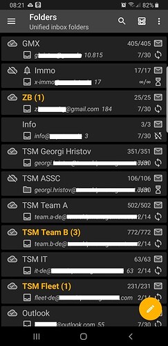
… and how do I refresh the mailbox? There used to be a button.
…and now there is pull-to-refresh in the navigation drawer. Either for one account or for all accounts, depending on if you are looking at one account or at the account overview.
i have, and i have. still a shame to see that everyone has to move to a new client.
The old version works fine, no need to move elsewhere.
I don’t see any moderators posting. Does K-9 read this forum?
I see several posts from developers @cketti and @ByteHamster
yes you’re right unfortunately they’re not writing anything about the screen overview
They have written plenty about it, but I guess they have nothing new to add. (Which I understand and respect.)
“They have written plenty about it”
where ? where ? where is that secret place you are talking about ?
At least in this thread: K-9 5.800 List of email accounts after startup - #172 by Ellen_L
And here us an interesting thread: Why was the account overview screen useful? - #64 by cketti
that’s the thread where they said that only a fraction of people didn’t like the new interface (false) that none of the explainations on other threads published before he started his own thread were explaining anything (false again), that he owned nothing to anyone only his own interest mattered without mentionning he got massive fundings from German tax payers money to take over the project with public interest as a goal (so false again).
So that’s not what I call an answer. That’s not what the thousands of people complaining about the new UI call an answer either. I’m not gonna repeat what many have said about that arrogant reply, I’m gonna get banned again.
And the other link you gave is just… not related to the remarks of the devs not answering
No. @cketti said “some”, which is true. He did not try to quantify how many or what percentage, because that is impossible.
when you have hundreds of people complaining on several threads and 4 people opening a thread to say they’re happy, saying “some didn’t like it” is a false statement.
“Some liked it” would have also been ridiculous due to the disproportion.
And it’s really easy to quantify : you just count how many messages per thread about it, you can even make that a percentage by using the happy 4 people, sorry 5 including you, divided by the number of unhappy users, let’s say 1000 people, multiplying by 100 that gives you 99.5% dissatisfied users vs 0.5% of happy users.
Obviously as there many more unhappy users than just one thousand we’re still better off saying 100%.
Even 99% is not “some people” it’s the vast majority, it’s the entire forum.
At least you agreed that his other statements were false. That’s “some” 66% agreement vs a vast majority of 33% of (unfounded) disagreement.
1.1. It is possible to know the percentage of unsatisfied users among those who have voiced their opinion.
1.2. It is impossible to know the percentage of unsatisfied users among all users. Others have said it before, and I think it is true: Satisfied users does not speak up to the same degree.
Which statements?
yes that’s exactly what I’m saying and that the dev estimated as “some”
The other statements were in my first answer to you.
We’re circling here, you’re happy ? great ! for a satisfied user you do speak up a lot. Yet not even close to balancing out the vast majority of unhappy, however hard it is for you to accept.
I’m outta here, you win.
This app has become a joke thanks to two dumb new devs who brag about themselves with a useless flashy new interface and don’t listen to the users. They don’t understand the basis of a good app either.
How to kill an app that was once efficient. Shame to the two braggarts.
