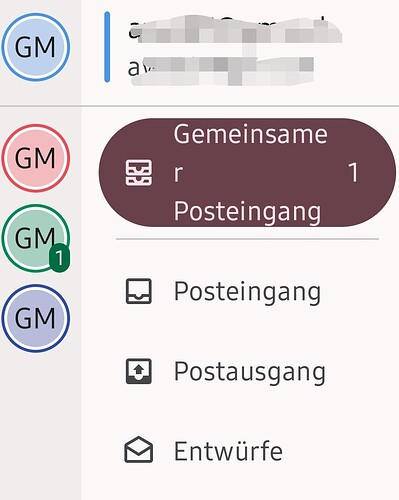
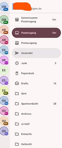
New layout not OK

Thank you for this background information.

But why delete the menu? In favour of a half-broken hurried interface? It still makes no sense.

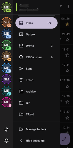
Also, why not both? The menu and the annoying useless little circles with useless initials in them. At least then we could ignore them.

5 Likes

I have restored version 6.804 from backup and marked K-9 Mail for no more updates.

The merging of something so obviously terrible from the upstream Thunderbird project is a very bad sign for the K-9 project. I will check back in a year. Maybe.

3 Likes

Yeah, now I don’t which is which…
Now you know how your users are using it.

Good luck ! :heart:

7 Likes

How to take an app, make it worse, totally trash it’s best features, tell us we’ll learn to love it, despite masses of complaints, and then how to make it even worse than that.

That takes a special level of pig headedness.

It might be fine if you have one account and love your screen taken up with ‘Toys R Us’ bling icons and rollovers. I remember the dev effectively said ‘well I like it so screw you’.

(That is just so Mozilla as well)

And “yes we might come back and look at the overview”

Liar. Never any intention I can see. And then he sold out to Mozilla.

And now they’ve done it again. Just like they have trashed Thunderbird and stuck their fingers in their ears, and silenced users on their lists by banning any criticism, no matter how constructive. The K9 dev is clearly amongst friends.

I think like many I’d go back to the original loved overview screen version tomorrow. It was sublime. But of course it will no longer install. Forcing you to upgrade to this utter shite.

Slowly been getting used to another mail app (and a dev who listens) and shaping it as best as I can. Still not as good as K9 used to be, but certainly better than this overblown mess.

It’s like a kids toy. Useless for anything in the real world.

It really is time to move on.

Fairemail is very comprehensive. Aquamail looks quite good too but more exoensive (I have no qualms and paying for an app where a dev listens)

Vote with your feet folks.

Leave this to die in a ditch where it belongs.
9 Likes

Ah yeah. Bet my complaint gets canned like the last time.

They don’t like criticism.

https://forum.k9mail.app/t/flagged-post-restored-by-staff/4958?u=reetp

(I’ve kept K9 installed to see if any dense would return)

Clearly not.

Time to close this chapter then.

3 Likes

Horrible layout and now the selected email color went from pink to so light, you can hardly tell what is selected.

5 Likes

compare: https://forum.k9mail.app/t/dont-show-account-selector-by-default-or-at-least-enable-account-pics/

3 Likes

The old folder layout was way more intuitive to use! The circles have all the same labels. Why not use and show the account name in a dropdown list instead of those UNuseful circles. PLS go back.

5 Likes

The settings should be found in the burger menu and the refresh button in the 3 dot menu. Stettings and refresh is not logical to be found in the account show menu.

4 Likes

Never should have changed the look! Typical developer behavior of “fixing” something that wasn’t broke to begin with. Unless you color code your accounts, you can no longer tell which is which account. Give us what we want, put back the old UI.

5 Likes

I find many of the above comments a little unfair, at least I find many of the above comments a little unfair, at least the wording lacks fairness. Why don’t you just go back and reinstall the last version, and see how this new release is going to improve over time ?
One comment so in order to help fixing a minor bug: when I select several messages (e.g. before deletion) the background color indicating “select” is a light grey which is hardly distinguishable from white.

No, it’s not unfair, it is about destroying a perfectly efficient tool - and no, it is not about just reverting to a former version which means additional work of de-/re-installing and at least entering all passwords again. This means additional unnecessary work and senselessly spent time. All just because somebody who did not understand what he/she did.

6 Likes

Flaming dumpster fire.

1 Like

I am also not happy with the new layout with the folder names. I only have one account, so the 2 letter blob on the left is not an issue, however the folder names and the weird spacing in the sender and subject line is annoying. Please leave it how it was. I did not download the new Thunderbird, I am still using K9, so why did this happen??? Please leave K9 as it was and get Thunderbird right before killing it.

4 Likes

How we can downgrade version 8 to older version, the new design is worst ever?

2 Likes

how I can change the colored bubbles with the same!! only!! two letters. Go back to the old design, or make it with more letters and adjustable!!! Design is currently a big degradation… too bad for the nice “old” and convenient design!

5 Likes
  1. Export settings from current version to file.
  2. Download preferred older version from GitHub: Releases · thunderbird/thunderbird-android · GitHub . I downgraded and stuck to 6.804 before all the broken UI and the changes that made the app unusable.
  3. Uninstall current version.
  4. Install older version from apk.
  5. Disable auto-updates for the app in Play Store and/or F-Droid.
  6. Start app and import settings from file.
  7. Re-enter passwords for configured accounts.
  8. Enjoy.
6 Likes

I have the very same problem.
This new design is a burden on usability.

4 Likes

Disappointing. Myriad complaints but nothing from Developers. Keeping your heads in the sand will achieve nothing but more dissatisfaction. Have the courage to stand up.

5 Likes

Like many people, I don’t appreciate changes that try to make something new without any real improvement. Microsoft is no stranger to such practices for its OS and its office suite!

The association with Mozilla will have brought essential support for OAuth 2.0 and probably a little more serenity for the developer.

Why these cosmetic changes? Make sure that, at the very least, account selection opens the inbox…

A fork is to be hoped for.

KOnki

4 Likes