K-9 Mail is back (5.800 release)

No, it’s true, I don’t. Sounds incredibly stressful whatever it is though! :slight_smile:

1 Like

This is not a point release, this is a major upgrade bordering on new product. I appreciate all the new whiz bang features. Encryption, yay.

But I have to agree that the new UI has made this once streamlined and intuitive application dumbed down click bloat. Removing controls doesn’t streamline the UI, it increases the number of operations required to accomplish a task.

No account summary on opening.
No account summary on ‘back’
No show only starred.
No show only unread.
No unique notification sounds per account.
And that’s after only a couple minutes exposure.

And I don’t know what the heck those “user icon” looking things at the top of the drawer are supposed to do. They seem unconfigurable and arbitrary.

I’m not looking forward to finding out what other subtle changes occurred that will disrupt my workflow.

It’s like someone walked into a pile of Git code without tribal knowledge and just decided to start dancing all Clockwork Orange on it.

I realize the app is free so we really don’t have any standing to complain. Maybe you’ll attract a grand new audience, at the expense of your once loyal following. Maybe that’s the goal. But catering to the lowest common denominator user makes product differentiation difficult.

I hate to see k9 become just another commodity app like Gmail.

I’ve managed to score a 5.6 apk. I’ll wait a little bit to see if the developers respond to users concerns.

If this is truly The New Way™, I’ll go back to 5.6 until it’s obsoleted by android.

This has been an unfortunate kick in the teeth for many, many users.

18 Likes

Most of us had no idea that an essentially ‘dead’ but still useful app was being destroyed.

7 Likes

I’m another user who just reinstalled v5.600 and happy with that.
Actually I DID remove the auto-update on Play Store immediately but last night the app updated anyway!!

BTW: on my Moto G5 plus with Android 8 the new icon background is a circle in a light rose color!!! …transparent would be better…

Me too I will keep an eye on what will happen in the next few months to eventually decide to upgrade or (sigh) remove K9 definitely… Even if I do not know what to use as a replacement since GMail app is not an option…

5 Likes

On a positive note:
I can now show my email passwords.
That’ll make setting up 5.6 again easier.

1 Like

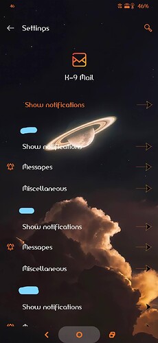
Go to your device Settings, Apps, See all apps, tap on K-9 Mail.
Then tap on Notifications and you’ll see a list of all your accounts and the options. Longpress on Messages - Advanced - Sound, there you can select any notification/audio file from your device. (Actual steps may vary depending on your device manufacturer, but on my OP7 that’s how to get there). The lightblue edits in my screenshot are the different email account names.

Repeat that for every email account and you can select seperate notifications for each one.
3 Likes

I briefly tested the beta in the past, I mentioned that the new UI isn’t an “upgrade” (lack of overview screen, action buttons on top) and was met with “it’s gonna be this way, period”. I guess it came to fruition and i added k9mail to upgrade blacklist in f-droid. 5.600 just works fine and I don’t see any point in upgrading, despite so much effort put into it, sorry.

9 Likes

Woah. That’s… convenient? Intuitive? Or not.

At least it’s effective.
Thank you. I would not have tried the long press. Now if I can remember all my old sounds…

Why not give K9 only fresh colors/optics and “under the hood”-improvements while maintaining the overall user experience?

6 Likes

The unique sounds are still there but the unique vibrations (rhythm & number of vibrations) have gone missing:

1 Like

No idea about that, I have all vibrations disabled systemwide since I absolutely HATE them lol.

And I have all sounds disabled, vibration is less disruptive and works better in noisy environments.

Like the majority it seems, I hate the new UI, please give us the option to have accounts overview as the default display, starred messages and all those other features that made the old version so good. This new version does nothing for me that Gmail’s app doesn’t do. So why bother keeping k9 now? I can’t come up with a single reason to keep it.

10 Likes
2 Likes

Thanks for that. I may need it, because the update keeps crashing my phone…

Exactly the same here. Nokia 6.1 with Android 10.

The old UI was plain and flat. No side menus, no swiping. Using the screen entirely with all important items (inbox, unread, favorites, folders, sync, etc) just one (in words: ONE) click away!
All reachable with just the thumb, even on larger screens.
There was text telling about updating within the app, there was text telling me what is happening when sending a mail.
There was a back button, that was a back button, not a quit button!
There was swiping possible to select mails very fast.

All in all it was lean, fast, easy, reliable, intuitive, informative and stable!

We really do not need to convince anyone as there absolutely was no need to change anything UI wise!

I haven’t spent the time to take a look at the development from 5.6 to 5.8 to see who thought the UI needed a change and more importantly, why!
Nevertheless, when it comes to software development, an update as huge as a breaking change like done to the UI is NOT an update from 5.6 to 5.8!!

It’s not only the new UI ruins everything k-9 was loved for, it’s also hiding change like that within 2 dot-versions! A change that huge needs a major version update as it completely changes the way the app is working! It’s not k-9 anymore! So do a new release “k-10” maybe!

All in all you want an explanation?
So please explain to the users why the devs are acting like script kiddies? Hiding major updates in a minor version bump against all development guidelines? Breaking changes with only 2 betas? A complete new app UI-wise under the label of a quality app? No announcements prior to the update? Why no 5.6.1 update just for announcement of the coming UI changes with a link to the betas, with explanation of the need to do so and a version bump to 6.x or a renaming to k-10?

Again, 5.8 is not k-9 anymore!

Nothing, nada prior to forcing a complete and breaking change!!!
We, the users, need to explain the devs the principles of software development?

Even not MS would put the start menu in the upper right corner and convert the double click principle of windows into a one click principle within a version bump from windows 10 to windows 10.1!!! An update is an update and an upgrade is an upgrade! Major changes need major version bumps.

Acting against all that needs explanations, not vice versa!!!

17 Likes

Hi, I’m also one of the people who signed up to the forum over this update.

I’ve been using the new UI through betas ever since they became available (two or so years if I remember correctly). While I agree that the account switch UI isn’t intuitive for those that don’t want to use unified inbox (+ some other concerns raised by others like filters), I do think that this UI change is a huge step forward for k-9. I feel like many of these concerns can be easily fixed by developers (like by adding an option to jump directly into account switcher by pressing back button etc).

I’ve also had some concerns when I first moved to the new UI, but over time I got used, and last week when I switched phones I found myself specifically going for 5.8 as I couldn’t stand 5.6 UI+UX anymore.

For those who dislike these changes on first sight, I recommend giving it some time to see if you like it or not, perhaps you’ll fall in love with it like I did.

4 Likes

Yes i am also very disappointed with this part of k9 now

2 Likes

As I posted in another thread, I used the SINGLE buttons for selecting READ, UNREAD, and STARRED messages so I could edit the UNREAD messages and DELETE the ones I did not want (About 200 - 300 a day!). Never had to press more than 3 times to delete ALL of my unwanted, junk E-mails. For this reason, please BRING BACK the old UI.

Thank you!

5 Likes