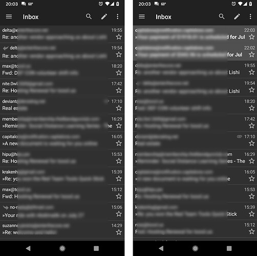
Layman speaking here but I’m struggling to tell whether my read messages actually are read now, because the overall colors of the dark theme are lighter. Even though unread messages are still lighter than read ones, the overall tone shift and the infrequency of me getting new emails means I go to my inboxes now and think “oh no, that’s a lot I missed” because the new “read” color is so similar to the old “unread”. I wish I could go back to solid black and white somehow, and may downgrade until then.
Yes, i agree that this is absolutely the case. The old version had a VERY dark “read” message color. Basically black. Now it’s a gray tone that is very close to the slightly lighter gray of “unread” messages.
thank you for the screenshot! It’s a subtle change, but I’m relieved it’s not just me that’s noticed.
I’ve held off on downgrading to see if I can get used to it at all but 16 hours later… still pining for the previous.
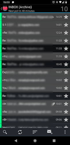
in case anyone is interested in seeing a direct comparison to the above images, this is what the previous and much better version of K-9 looked like in the message list. Not only do we have a nice large “10” at the top showing me the total number of unread messages, but the unread messages themselves are MUCH brighter gray than the absolute black messages which are read already.
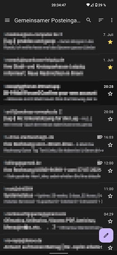
The dark theme is getting difficult again… the grey is now a dark grey.
why not let the user set the colors/font-style?
Hey Y’all, I’m Michael, the new Manager of Community Programs at Thunderbird.
Firstly, Thanks for the feedback & kudos on the great username. I wanted to share some feedback straight from our UX & Design Team on this topic:
“We’re working within Material 3 guidelines as much as possible, while harmonizing with our desktop experience where it makes sense. For contrast, we’re prioritizing font size and weight to make new/unread messages stand out clearly. Users can optionally enable a background change for read messages under Settings > General Settings > Display > Change colour when read this - shifts the background from surfaceContainerLowest to surfaceContainerLow, slightly reducing contrast while preserving the strongest contrast for new messages.”
We’ll keep you posted as timelines become more clear.
Thanks for the reply. I’ll try to deal with it constructively.
I’m not familiar with these guidelines. I have no idea what needs to be used. So I searched and found something that is thematically relevant:
In dark design
K9 background color unread mail: #131314
K9 background color read mail: #201f20
K9 background color unread mail UX screenshot: #101011
K9 background color read mail UX screenshot: #1a1a1a
M3 Surface Container Lowest: #100d12
M3 Surface Container Low: #1e1b20
M3 Surface Container: #211e24
M3 Surface Container High: #2c292e
M3 Surface Container Highest: #353238
In light design:
K9 background color unread mail UX screenshot: #ffffff
K9 background color read mail UX screenshot: #f4f1f0
M3 Surface Container Lowest: #fff7ff
M3 Surface Container Low: #f7f2fa
M3 Surface Container: #f1ecf4
M3 Surface Container High: #ebe6ee
M3 Surface Container Highest: #e5e0e8
So in the screenshot, it’s between Lowest and Low. The version on my smartphone is better…
K9 is definitely not for people with poor eyesight.
Apart from the colors…
There is a green dot in Thunderbird – maybe that concept would help here?
Users have different needs. Allowing users to choose their own colors would be best. This latest change makes the app virtually useless for me.
Sorry, but they do not stand out clearly w dark theme. Have had to switch to light theme (hard on the eyes and a battery killer) twice in the past month IRL, to see what was going on. It’s not great either, but is better than dark. This contrast between read/unread used to be fine in datl theme. Now it is essentially useless. I’m missing new messages that look like I’ve already read them. A month ongoing is about to be a deal breaker after years of K9 use.
Whatever the “reason” for the change, it is NOT better. Please fix this.
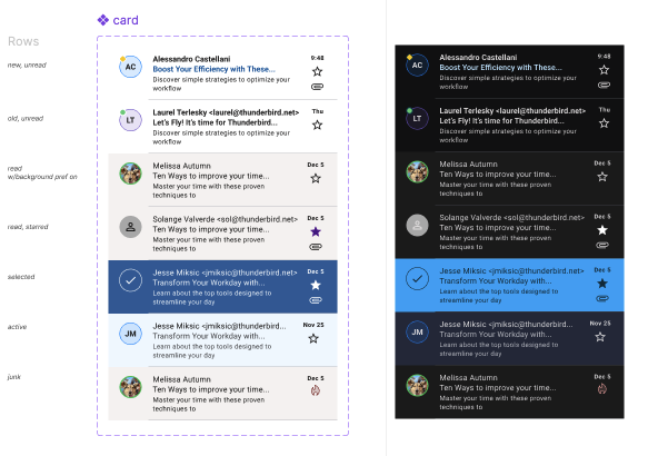
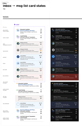
Hi all, we did a bit more work to get all the states down and aligned to the design system & cross-platform. Have a look at the design system if you want more specifics on colours and alignment with M3:
TFAndroid Light
TFAndroid Dark
Why can’t TBird solve it like FairEmail for example? There I can select to show a kind of colored “frame” around unread messages, making it much easier to distinguish between read and unread.
Or you know - just go back to how it was before you changed it so the difference wasn’t visible any more ![]()
I chime in with this issue, I was gonna open an issue as I thought this was a bug caused by having switched phone to a lower android version, but it seems an intentional change betweem k9 10 and 11.
The new way of indicating read/unread messages is now the opposite of how it was before, making very hard to understand which is which.
Earlier light gray meant unread, and black meant read, now it’s just a small gradiant difference, with black actually meaning unread.
I understand it’s because of matrial design guidelines, but that doesn’t make it any better to look at.
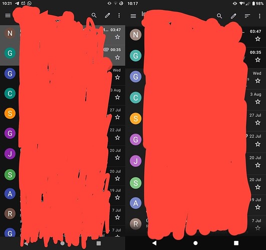
For context, since there’s no “before” screenshot from k9 10, on the left is how it was before, on the right is how it is now.
Thank you for trying to explain the reasoning behind this change. I already had the “Change colour when read this” setting set. The difference between the read/unread messages in the list with this setting on is unfortunately hardly visible.
I do understand that the team wants to follow guidelines. However, I do not understand why the read/unread backgrounds should be surfaceContainerLowest / surfaceContainerLow. An unread message is a different thing compared to a read message and therefore it seems logical to let it stand out. The visual difference between bold / not-bold is not big enough to easily recognize unread messages. A different background-color (as it was in version 10.1) helps a lot. Perhaps “inversePrimary” is a good choice, still a dark color with good contrast with white text.
I have now downgraded to v10.1 to get the better behavior, hoping that a version 11.1 will restore different background colors for unread messages.
(Hint for others who want to downgrade: you need to uninstall the app and then, in F-Droid, you can opt to install the 10.1 version. Before doing so, exporting your settings is your friend, but it will not store your passwords, so keep those ready)
As a developer myself, I definitely understand the need for standards and the desire to follow them. However, if they come at the expense of usability, either the standards are bad or you haven’t implemented them properly. Instead of using lowest and low, why not lowest and medium? At least that would provide more contrast. Better yet, let users pick their levels - even if limited to those 5. Until some substantial change is made to make it usable again, I’ll be sadly searching for my next email app.
Well from the changelog it sounds like the latest Beta fixes that issue. BUT … since the TBird app won’t let you install a Beta over a Stable (or vice versa) we’re stuck waiting for the Stable to get that fix.
Why can’t the app signature of the Beta be made compatible to the Stable? Other apps (like Battery Guru) let me install a Beta over a Stable (and the other way around) without any issues. How are we supposed to test the Beta if we can’t update the Stable with it? I don’t want to basically keep the same app installed twice, having to set it up twice, just to see + test the changes!
