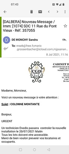
The message header looks awkward with wasted space. We need to be able to at least select bold for the subject and not bold for the sender. I’ve set the size for the subject larger here but really need it bold rather than much bigger.
Too much white space in the header e g. The coloured symbol takes up too much space and wastes the space below it.
The previous version layout was much neater.
Thanks
